

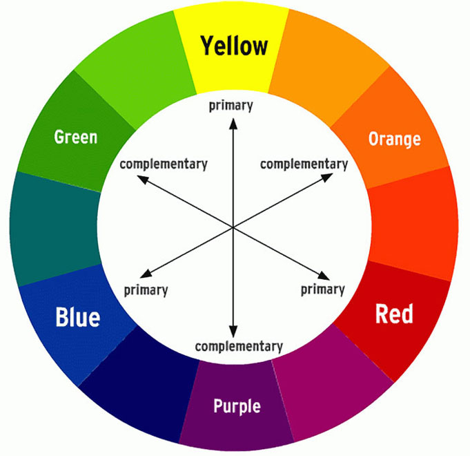
This color circle has always fascinated me. The circle is based on the three primary colors; yellow, red and blue. They are primary because they are impossible to create. If we mix any two of the primary colors, we’ll have the secondary colors orange, purple and green. If these again are mixed we’ll have the tertiary colors.
But the really fun part is the complementary colors. These are the two colors that stand directly opposite each other in the color circle, such as red and green and purple and yellow. If you stare at a color, for example red, for 30 seconds and then look at something white – like a blank piece of paper or a white wall, you will always see the complementary color to the original, in this case green.
For interior design or design in general, this makes a very exciting mix. Myself I love to play with these combinations on different types of design. The colors are equally strong, complement each other and at the same time fight for attention. Therefor the best is to use one as a base and the other for details.
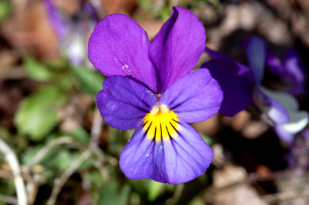
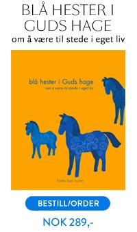
On the cover of my book “Blå hester i Guds hage – om å være til stede i eget liv” ( Look above at the right side here!) I choose the orange – blue combination which I do like a lot. It is also worth noticing how the nature itself also know how to work these combinations. An example is the beautiful purple – yellow Viola tricolor.
“To express the love of two lovers by a marriage of complementary colors, their mingling and opposition, the mysterious vibration of kindred tones.”
—Vincent van Gogh, September 1888